Friday, October 12, 2018

Jamie Brick's Fantasy in the Forest


Fantasy In the Forest, July 2018 South Frontenac

Twenty-four years ago, long before I met them, sculptor Jamie Brick and his wife Annette of South Frontenac, Ontario launched an art show called Fantasy in the Forest. Every summer around the third weekend in July they and an eclectic and ever-expanding group of artists transform a pretty forest glade into a magical kingdom. Thanks to Meghan Balogh and the Kingston Whig Standard I am spared the necessity of describing it further as she has done so very well in her article. In fact, to give credit where it's due, she captured the subject matter in my photo above in her own image and identifies and credits them appropriately. So please do read her article to get the full story!

Jamie Brick's hat-wearing castle surrounded by tents and other permanent structures, July 2018


The castle October 2018

More recently Jamie and Annette decided to mount a fall version of the show on Thanksgiving weekend, and this past weekend I was honoured to be invited to participate once again. Some years ago I exhibited as an artist myself at an earlier iteration of the summer show, but with a career focused on corporate and commercial photography I found I needed to put making "art" art (I'm making the distinction because I approach all  photography as art) on the back burner. 

At least once a year,  however, I allow myself to indulge in some creative play when I produce a small series of images for my annual mini-desk-calendar designed by my talented friends at Finesilver Design. This year I decided that instead of making new pieces I would revisit a series of insect and bird images I made a while back. Coincidentally these were the images we selected to hang at the Fantasy show. Thus ensued a mad rush to complete the calendar design and get them printed in time to sell alongside the large framed limited edition prints. 

As a guest, I did not have my own exhibit space, but rather showed my small offering inside King Jamie's castle.

My little section in the castle: 3 framed limited edition prints, and my little 2019 desk calendars

My 2019 mini-calendars for sale

Jamie is renowned for his whimsical sculptures, from miniature to life-sized, but he also makes mixed media paintings and produces greeting cards featuring his paintings and drawings.

 Jamie Brick's cards and paintings, on exhibit and for sale, and the back of one life-sized bust

We bought one of Jamie's whimsical holiday ornaments, which, as I type, stands on a little shelf in my studio waiting to be deployed in a few months on our Christmas tree. 
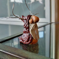
Jamie Brick Christmas ornament
Jamie Brick Christmas ornaments for sale

While the fall show is smaller than the more well-established summer show,  it still featured many of the summer exhibitors like Matt Crossman of the Glass Shack who we could watch from Jamie's castle.

Matt Crossman of the Glass Shack at work at the show

Fantasy in the Forest is a truly one of a kind experience and has grown so popular that this past summer the police were called when traffic congestion got a little out of control due to overwhelming turn-out. Rest assured, though, organizers leapt into gear to rectify the situation; parking space has since been expanded, there are traffic patrols, and there's now a shuttle bus from the overflow parking lot to the show. 

Rumour has it that I may once again join the list of exhibiting artists come summer 2019. But whether I'm there or not, I encourage readers to follow Fantasy in the Forest on Facebook and put the show(s) in your schedules. It really is not to be missed. (Please note, BTW, that the fall show dates may change from Thanksgiving weekend to a little earlier in the season.)

And for those of you who receive my little calendar each year, or would like one, they're ready! Way ahead of schedule!

Thanks for reading. I'd love to hear from you.

kathryn@hollinrake.com
www.hollinrake.com

Monday, April 16, 2018

George Brown College 50x50 Exhibition

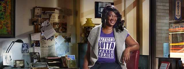
Detail from "Elaine Lloyd Robinson" by Kathryn Hollinrake. To see the whole image, please click HERE.

In September of 2017 I received an e-mail forwarded from a friend (thank-you Sonja Scharf!) who thought I may be interested in a contest George Brown College was running with the ultimate goal of mounting a portrait photography exhibit in celebration of the 50th anniversary of the Ontario College System. The plan was to select 50 photographers who would be paired with 50 GBC graduates who were born outside Canada and whose livelihoods were significantly impacted by their experience at GBC. The photographers were to "tell their story through a photographic portrait." The exhibit would take place during the May 2018 Scotiabank CONTACT Photography Festival. 

I have been working on a series of environmental portraits of (creative) people in their spaces for years now, so I was excited at the prospect of GBC's finding me a new subject. However, when I was notified about my subject assignment, I have to admit I wondered about the fit. Then weirdly, as if the universe agreed, she could not be reached. Eventually the exhibit producer had to find me a new subject.

Elaine Lloyd Robinson was born in Jamaica and came to Canada as a little girl. A graduate of the Community Worker program (2007) she had wanted to participate in the 50x50 but missed the deadline to  make it onto the list. So when my first assigned subject disappeared, the path to Elaine’s participation reappeared, and I got her! If I believed that things happen for a reason I’d believe this did. We got together for a coffee and despite having vastly different backgrounds, quickly gelled over some unexpected shared experiences, including having a mutual acquaintance (another photo subject/client of mine), and being almost exactly the same age. Not only that, but to my surprise, and delight, Elaine told me she knew where she wanted to be photographed -- an unusual independent book store that had great personal significance to her -- A Different Booklist. The second she said "book store" I knew it was likely to be the perfect kind of space. And it was.


Snapshot of the corner of A Different Booklist Cultural Centre, the incubator for Elaine's newly launched business G.H.E.T.T.O. Stories.

Elaine put me in touch with Itha Sadu, co-owner of A Different Booklist, and I went to see her and what is actually much more than a book store. It is, in fact, a long-established and recently expanded -- in it's new home of just a year since it moved from the west side to the east side of Bathurst near Bloor -- cultural centre and community hub. I fell in love with its southwest corner almost instantly and snapped the picture above so I'd have a reference as I previsualized what would be the final portrait. Thanks to Elaine's long history of involvement and collaboration with Itha and A Different Booklist, Itha's response to my request to shoot there was "Anything for Elaine!"

We had to shoot at night because I needed relative darkness outside and inside, so with the deadline for shooting approaching we chose a night that worked for everyone, only to discover we'd have to wait until an event scheduled for that evening wrapped up. Even though we started a little later than I would have liked, the pressure of having to make a slightly complicated piece of photo art under a tight timeline woke me right up.

While I waited for Elaine to arrive and the tireless Itha continued with a post-event meeting, I started to set up, testing a few different chairs and some standing poses until I figured out what would work best.

This was not a pose that was working.

Elaine arrived with her make-up done, and changed into the wardrobe we'd discussed, specifically and most importantly a t-shirt promoting her newly-launched business G.H.E.T.T.O. (Getting Higher Education To Teach Others) Stories. Then just as I started to position her, a tiny eyelash-shaped disaster!  One false eyelash had sprung loose, we didn't have any glue, and it was way to late to go out searching for any. Thankfully the not-to-be-stopped Elaine managed to make it stick back on long enough to get through the shoot. I actually have a Photoshop brush preset for adding eyelashes to portraits, but it was nice not to have to use that.

The final image was to be composited from multiple, different exposures. The first and most important image to capture was Elaine. I knew ahead of time that I would be replacing the part of the background in which the light stand appeared, and I actually thought I might leave in the flash head for a little extra drama and flare. Unfortunately I later changed my mind, so I had the additional job of digitally fixing (ie. removing) the flare and the resulting colour shift created by that direct-into-the-camera light.


Exposure just for the Elaine portion of the final image.

The second shot was Elaine in exactly the same position but lit differently, purely to provide small bits of colour and detail, on her, where they didn't appear in the primary shot. It's worth noting that nothing about the pose was left to chance. I literally placed Elaine's hands and feet where I wanted them to be, and she held perfectly still for two consecutive exposures. 
 
Above Left and Right: the second exposure. Left, as shot, and Right, as adjusted in processing.

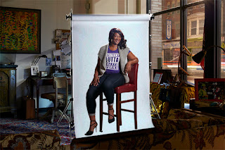
In reality, since I knew I was going to have to digitally remove the background from Elaine's frames in order to replace them with bits and pieces from the  frames specifically shot for the background, I should have sucked it up and brought a couple of extra stands and a seamless paper backdrop to put behind her:

What I should have done.

It would have made the close-cutting way, way easier. Once Elaine's shots were done, she stepped out and the subsequent exposures were all about the background.

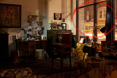
This frame gave me my favourite capture for the window.

The final composition was constructed from nine different exposures, processed up to three different ways each, with specific details from each frame cut out, added layer upon layer, and adjusted as I saw fit.

One frame adjusted and processed three different ways.

One section of the image built up with the addition of layers and adjustments.
Left: Exposure for the background. Middle: exposure just for the lamp. Right: Background and lamp exposures combined.

The whole shoot took less than two hours (less time than the post-production). Two high energy entrepreneurs, Itha had visitors even after we started to shoot, and Elaine was making phone videos for social media right up until I had all my gear packed and ready to go.

By the time you read this Elaine's business will have officially launched in April 2018. Check her out: Click here to watch her interview.

I wish her all the best! I'm so grateful to have had the chance to meet such a fascinating, and enthusiastic subject with such an inspiring story, and such a cool place to shoot, and I'm so honoured to be able to contribute to the sharing of her story. Thanks to GBC and everyone who worked so hard on this project!

Please check out the exhibit between May 1 and May 31, 2018 in the main lobby of GBC's waterfront campus at 51 Dockside, Toronto. Opening May 10, 2018.

You can reach me at kathryn@hollinrake.com
And see my work at hollinrake.com
I'd love to help tell your story!


Friday, February 9, 2018

Corporate Photography - CCNM's 40th Anniversary Annual Report

Cover of CCNM's Report to the Community (AR) 2017

As the Canadian College of Naturopathic Medicine approached an important milestone this year, it followed that their annual report (aka Report to the Community) would be a special one. Designed by Bhandari + Plater, it was an ambitious undertaking that ultimately affirmed the value of planning, 110% effort by all players on the team (clients, designers and photographers and subjects/contributors), and client commitment to a design concept that might have required a little more money, time and effort, but which succeeds resoundingly in its resulting strength, attractiveness, clarity and cohesiveness.

By its nature this project required some especially tricky and precise planning on the part of the college. We needed to create three (plus) main sets of images: 1) the cover portraits, 2) executive committee and leadership team portraits,  3) environmental portraits of important subjects (such as graduates, donors, and partners) holding 'signs' on which key pieces of information would be imposed, and the 'plus' -- similar portraits of these subjects not holding signs. In total over forty portraits of twenty-five different subjects (a number of whom do not work at the college or even live in Toronto) in multiple set-ups.

The first thing we needed to do was decide exactly where each environmental portrait would take place. So, prior to shooting, we spent several hours going around the college photographing stand-ins (assistant Lindsay, and client liaison, communications and marketing specialist Sana) in proposed locations based on rough, initial layouts and collaboration with the designer, Lindsay taking notes and pictures regarding camera and subject positions. Once the selects were made these pictures were placed into precise layouts, subject to notes from the designer, which we would use as templates for the final shots. 

Left: Layout page made from snapshot of assistant Lindsay taken during location scouting. Middle: the final image in the AR. Right: an alternate shot, sans sign, for future possible uses.

While Sana booked all the spaces where we'd be shooting, one thing we could not do was block them off during the shoots, so if there were students etc. about we would have to work around them. Mostly this just meant we'd have to wait a few seconds now and then for student 'traffic' to clear. I admit, we were slightly flummoxed, though, when we did try to block off one small area to save students being exposed to a bright flash, only to have the odd few walk right through the barrier (right next to the flash unit) instead of around it. Clearly they were extremely focused on getting to their classroom using the shortest,  straightest route possible.

While most subjects to be photographed were able to make the trek to CCNM, others were not. And even the ones who could were not all, of course, available per our proposed schedule. Furthermore it was exam time at the college meaning classrooms (where we'd be shooting the head and shoulders portraits) were reserved whether they were needed or not. Thus we found ourselves setting up in one classroom, then having to re-set-up the same set the next day in a different room, and finally at one point resorting to shooting in the lobby. Thankfully the whole front entrance of the college was under heavy construction, so we were able to create a mini-studio right in front of what would normally be the front doors. What was a significant source of frustration for the school became a boon for us. 

Knowing we were going to have to recreate sets multiple times we were careful to diagram and photograph them. Also, at the behest of the designer, we made sure we did "plate shots" of the backgrounds.

Cover portrait background 'plate shot'

 And good thing we did, because thanks to forces beyond our control, two of the four portraits we shot specifically for the cover ended up being replaced by portraits we had shot on a slightly different gray backdrop, and with slightly different lighting (eg. no hair light) and different parameters in terms of subjects' expressions, for the interior pages of the report. We couldn't fix the hair light situation during post-production, or make the expressions 'bigger', but we were able, at least, to digitally composite in the correct background during post-production to create more consistency between the four cover shots, which helped a lot. (It would not have been easier to simulate this particular kind of graduated background in Photoshop.)

Continuing with the topic of scheduling, as it happened we had to shoot in the cafeteria, on two different occasions, at lunch time. While we actually found the background looked great filled with students, we did have to wait occasionally (again) while students moved in and out of frame, and ask the odd person to reposition themselves slightly, or move a big winter jacket or other distracting item out of frame. The biggest challenge was communication with the subjects and each other over the din of the students chatting. I had to resort to hand signals and to running back and forth from the subject to the camera when I had anything remotely complex to convey.

Subject photographed in the busy cafeteria at lunch time

The cafeteria wasn't the only place we couldn't readily communicate with the subject or each other. One of the shoots was in the library where students were studying for exams. Here we were limited entirely to sign language. And we really had to be as unobtrusive and quiet as possible. Working in our favour was our desire to make the lighting look somewhat natural, so in most cases we used only one indirect light, cutting down on set-up and related noise and disruption.

Left: Sunlight, room light and one indirect flash combine to light this portrait.

Another stumbling block was encountered when it turned out that the doctor in Ottawa who we were hoping was coming to Toronto, wasn't. CCNM could have hired a photographer in Ottawa, but the consistency between images would have been compromised and I really wanted the designers' vision to be realized as near-perfectly as possible, so I offered to visit a friend (in Ottawa) and do the shoot there. In Ottawa my assistant (a local) met me at the location. As we had diagrammed our portrait sets in Toronto, it was no trouble to set up a similar set in Ottawa. Thankfully there was just enough room in one of the offices. It also turned out that another subject whose portrait was needed was in Ottawa, so we were able to photograph her, too.


On set in Ottawa ©DarrenBrown

If there was any drawback at all to the sign holding concept it was that previously shot photos, no matter how great the images, would not work for the feature pages because the designers needed to be able to put a sign in the subject's hands. Thus, in the case of this busy ND (naturopacthic doctor), who we had photographed some months ago, we found ourselves shooting his background (ie. the location we had designated for his shot) at CCNM without him in it, then driving up to his clinic in Maple, setting up as quickly as possible out of the way of patients in an upstairs hallway, and grabbing the necessary 'sign holding' shot. (Note: We couldn't have done these two shoots at the same time, in any case; by the time we did the AR shoot winter had set in, there was snow on the ground and the trees were leafless.)

Upper left: an image from a previous shoot at the clinic which took place on a beautiful fall day. Right: final composited environmental 'sign holding' portrait for the AR.
The two photographs that, combined, made up the final image above.

Page from the AR showing the value of shooting consistent looking portraits. This page looks so nice!


One of six spreads throughout the AR featuring subjects holding a sign 

Before I wrap up, just a couple of observations I wanted to fit in here somewhere in an attempt to recognize the humour that can sometimes seem less accessible in the moment:
1) December 2017 saw an unusual number of very cold but very dry days resulting in some crazy static-y hair antics. Thank goodness I carry hair spray. We needed it! And 2) No matter how diligently subjects attempt to follow my helpful hints and arrive in wrinkle free clothing for their 'close-ups', there are times when, really, it may be better to just go with a knit. :)

If you'd like to see the whole report here's a link to CCNM's publications: https://www.ccnm.edu/about-ccnm/publications. This one was so worth the extra effort, and I trust I'm not the only one who thinks so. Way to go team!

Thanks for reading. If anyone involved in this project can help you with your next project let me know!

kathryn@hollinrake.com
hollinrake.com  

Monday, January 22, 2018

Flower Photo-Paintings: My 2018 Calendar

Dinner Plate Dahlias

Henri Matisse apparently said "There is nothing more difficult for a truly creative painter than to paint a rose, because before he can do so he has first to forget all the roses that were ever painted." This is what confronts me every time I feel drawn to photograph one of the world's most drawn, painted and photographed subjects, not to mention the fact that it always feels a bit like cheating to photograph a flower, because really, how far wrong can you go?

Still, à propos Henri Matisse, the imperative is to come at it with, hopefully, a somewhat fresh perspective. I've posted before about my erstwhile desire to be a painter, not unheard of for a photographer. Combining painting with photography gives those of us who do it the chance to dabble in that other world, while creating truly painterly photographs.

For these images, I painted one small backdrop for each shot. When choosing the foliage and painting the backdrops it was all about the colour and shape of the flowers or plants and what colours and textures in a background would 1) overlap themselves to create a pleasing effect, and 2) complement the flowers, while overlapping and combining with them. There were some missteps.

To expand a little on the technique, the foliage was arranged either directly on the backdrop or on a piece of glass above the backdrop. Once the first exposure was made there were generally either one or two more exposures made after rotating the backdrop (90 degrees each time) and repositioning the foliage. The foliage had to be positioned so that the stems came consistently from one direction within the frame, to avoid a messy, and weird starfish kind of look. 

Double exposure resulting in a two armed "starfish"

The trickiest thing was to try to visualize how it would all actually combine, since I couldn't see the result until the final exposure was made and the frames combined, whether in camera (using the multiple exposure setting) or later in Photoshop. So there were quite a few do-overs and a lot of concentration required as I figured out what worked and what didn't through trial and error, a process which had to be somewhat limited given the delicacy of the subject matter. I was reminded again of the days of film photography when you never really knew for sure what you had until you got your film back from the lab, and there was always the possibility that you'd get a delightful surprise (or not).

The first shot I tried was the hydrangea, and once I realized the bit about the orientation of the stems I got my first and possibly favourite shot of the bunch surprisingly quickly:

Hydrangea Overlap, the first and one of my favourites of the series

Unfortunately, not all five subsequent shots were as easy, as I suggested above. Ultimately some of the double and triple exposures just did not work on their own, or at all, so I had to succumb to using a little, and in some cases a lot of digital editing. The Dinner Plate Dahlias (top of this post) were hopeless in camera. Most of the overlapping had to be done on the computer.

As always with my annual mini-calendar shoots, it was imperative that the images work as little, tiny pictures less than three inches across. And again, as always, this meant some lovely little image details became tough to appreciate once the images were sized, and published in the calendar. 

I like this image of these unidentified green plants, but...


...I love this detail

Here is another one with subtle textures and details that are easier to experience close up.


Detail from image above

And finally, the one we chose for the calendar cover: 

Mostly done in camera with a tiny bit of Photoshop. I didn't even mind the "starfishy" stems at the top.


I have included a few of these images on my website where you can see them more clearly. There are also fine art prints available for purchase. 

I owe a huge thanks once again to Martin Finesilver and Mark Smith of Finesilver Design, without whom these calendars wouldn't exist. I can't wait to get started on next year's!

In the meantime, if you'd like one please give me a call or drop me an e-mail. And if you have something you need photographed creatively, please reach out. 

kathryn@hollinrake.com
hollinrake.com